Designing for trust: Powr of You case study
PY Insights is a consumer intelligence tool that connects brands and consumers to learn and earn from their digital footprint.
Client: Powr of You / PY Insights - (rebranded as PY insight)
Role: Product Designer (Research, Strategy, UX/UI design)
Work: Product Design, Brand Strategy, UX/UI
When: March - April 2018

The ask: Improve user retention through improved productivity insights
The startup was noticing low user retention rates and poor site engagement. They approached us to identify the underlying issues and root causes of the problem. I led a team of 2 UX researchers to produce new homepage iterations and strategic recommendations.
Reframing the problem
Improve user retention by simplifying the on-boarding experience and offer smaller, but more frequent rewards.
Through our research, we realized that productivity insights were not a compelling product offering, defeating the hypothesis that it would drive greater retention. In response, we proposed a new hypothesis grounded by our research insights and usability tests.
Solutions:
By identifying user needs and pain points, we then designed around these aspects by setting the right expectation upfront. By understanding what were key concerns for users, we were able to organize information and prioritize appropriate messaging to drive greater user engagement.
Redesign of web homepage
Optimized mobile user experience
Measure effectiveness via usability tests
Platforms: Web and Mobile
Tools: Sketch, Axure, InVision, Adobe Illustrator
Metrics: Reduce bounce rates, improve user retention, improve site engagement.
Result: Redesigned web landing page and optimized product strategy.
Research
Helping brands gain a 360 view of audiences
Powr of you is connecting a fragmented cross-platform customer data (social, browsing, mobile) in one place to provide businesses a 360 view of consumers. Brands can make marketing and media planning decisions based on first-hand data. Consumers benefit by earning rewards by passively sharing their online browsing data with consent.
Designing with context — GDPR + Facebook Cambridge Analytica

When we first received the project brief, Facebook's Cambridge Analytica crisis was forefront of the news cycle, and a month before the launch of GDPR in the EU. Consumer data and privacy was at the top of peoples' minds.
Our research process reflects additional efforts to thoughtfully understand trends impacting Powr of You's consumer data intelligence product. There was little prior user research client-side, requiring our team to work to flush out user research before moving into design.
3 week design sprint constraints
Our work prioritized on identifying key trends impacting the product and identifying user paint points from a usability and experience design perspective. Given our time constraints, we were limited in our ability to produce a more holistic solution, but rather a one-off concept to help inspire and and increase empathy and understanding of user needs for our client.

Usability testing insights
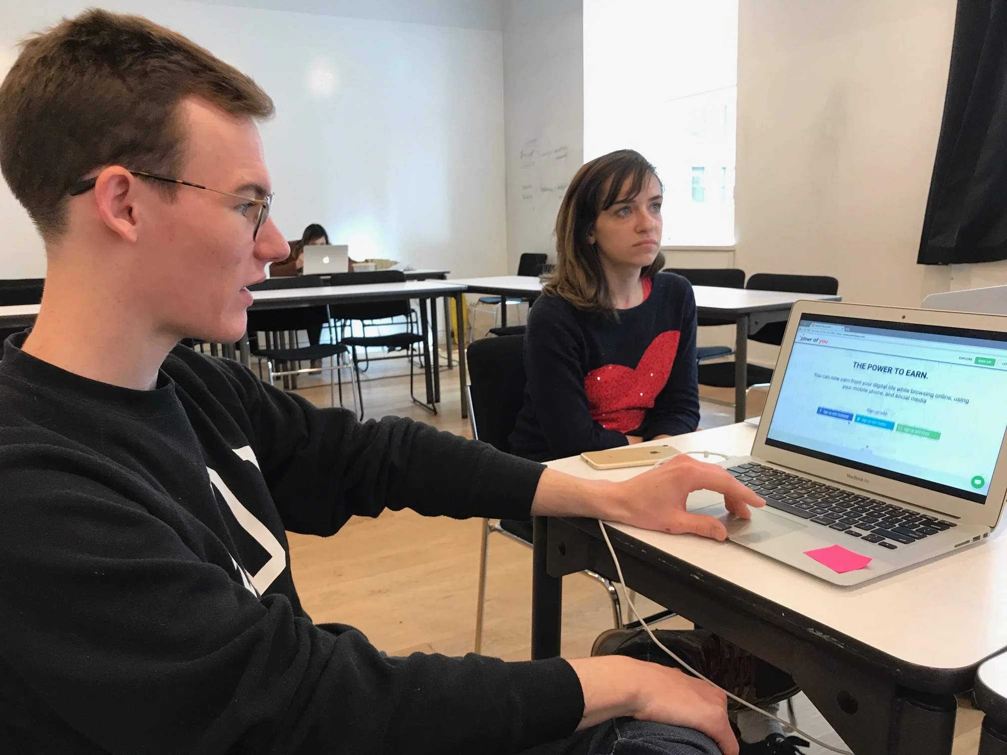
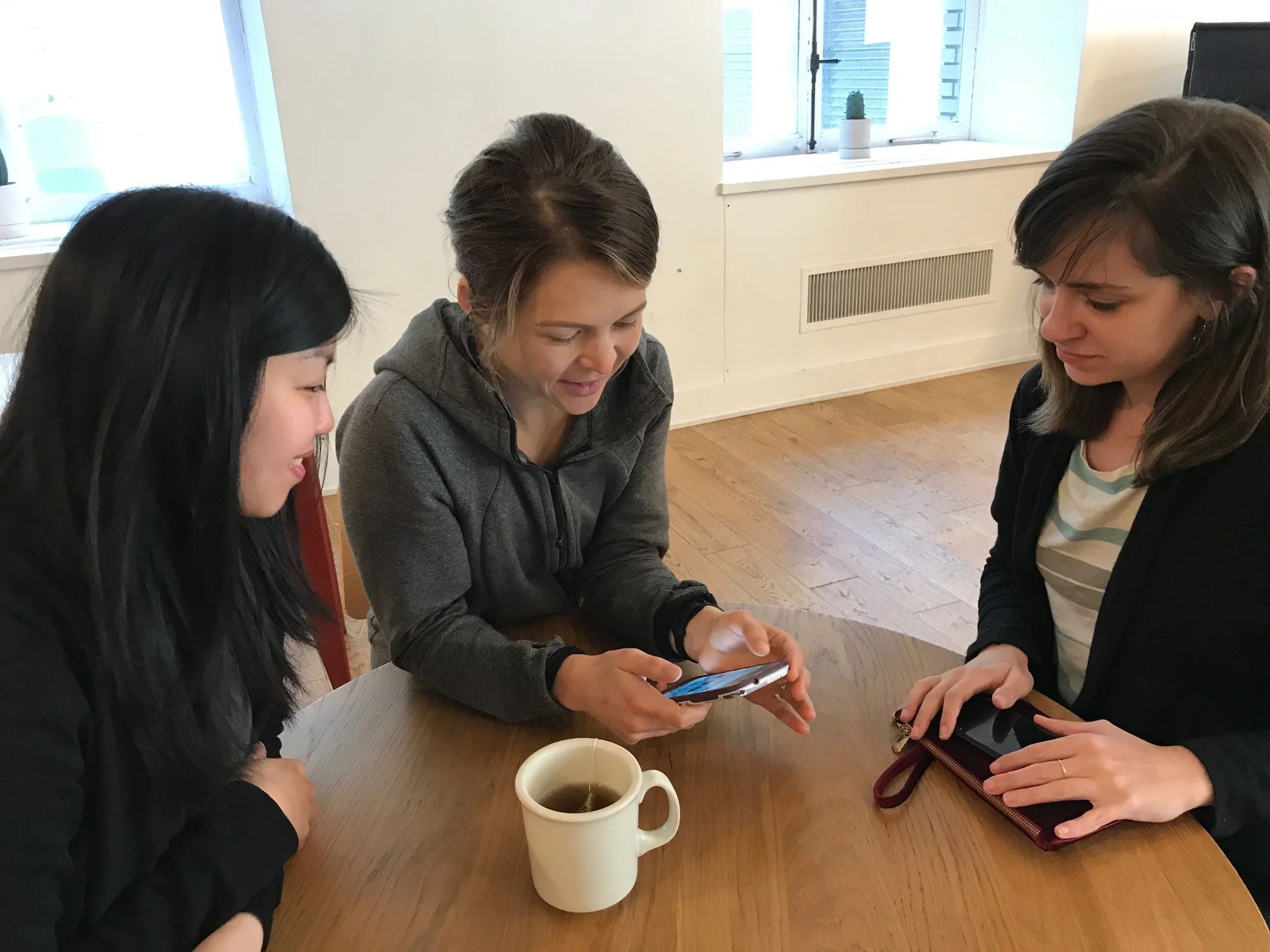
We organized our usability tests into two major tasks that we wanted our users to act upon. We conducted usability tests on 4 users for each category and tested on both desktop and mobile devices for both iOS and Android.
Sign up and create an account
Sync plugins for data collection
What users were saying
"It felt like I was doing my taxes."
"Why do I need to share so much information?"
"I don't really understand what I'm trying to do here?
User feedback helped us understand the importance of setting clear expectations and progressive disclosure.
Actionable Insights
Clarify value proposition
Copywriting did not clearly communicate value proposition and features. Overall language failed to inspire a sense of confidence in product offering.
Resulting in users feeling a sense of mistrust as they progress through the user journey.
Optimize the sign-up process
Users were not clear why so much information had to be shared so early the process.
The benefits of doing so were not clear, resulting in users feeling a sense of unwillingness to complete sign up process.
Prioritize for a mobile experience
The product experience was split into desktop + mobile but offered no clear differentiation and further purpose than replicating the same experience.
Users suggested that the mobile experience was far stronger and easier to use than desktop.


Competitive Analysis
Users want instant gratification and an easy sign up process.
Our competitive research revealed that users highly appreciated experiences that are easy to sign up to and offered an instant reward upon completion. There was a hook that helped pull them into the experience.

Google Surveys is designed around quick surveys that provide instant rewards, but requires an incentivized payout at $2.00

Zap Surveys is designed around provided a massive hook and reward up front, rewarding users $6.25 for completing the initial survey, but requires a payout accumulation of $25.00 before being able to cash out.

Addressing paint points across the user journey
As we synthesized our user research, we identified three key areas impacting the retention problem, starting from a root cause of a poor user experience. Users did not have the right expectations upon learning about the product, and the account creation process was overbearing. In addition, if users managed to get through those hurdles, survey opportunities were too few and infrequent.
A frictionless on boarding experience is helps retain users and acquisition efforts.
Our analysis of the account creation flow demonstrates an overwhelming amount of information requests. As a result, the majority of users were failing to get past this step. Our recommendations focused on collecting this information progressively.

What we’ve learned by discovering the pain points across the user journey
Discovery - Users had the wrong expectations about what benefits they would gain from using the product. Without addressing this in the first place, all the other areas of the user experience would be compromised.
Onboard - Existing sign-up process took excess of 2 minutes, while competitors offered a quick 10 second experience. Upon sign-up, users were prompted to complete an extensive demographic data form. This specific section caused users significant stress as it was asking for more information that necessary to complete the sign-up process. Sign-up should be about getting users into the platform as fast as possible.
Platform - The experience between mobile vs desktop is not clearly differentiated - users were lost about the differences. Given resources and ROI, mobile focus should be prioritized
Retention - Without an instant hook - users didn’t have the motivation to complete the first few actions. Most competitors offered an instant reward for users to earn for simply signing up and providing some basic demographic answers.
Without fixing the homepage to clearly communicate the product to our users — all other areas of the user experience would be compromised. Redesigning the homepage was the first step to fixing these problems.
Designing the homepage
Based on user interviews, users wanted to gain further confidence in the product and service. The current site map only provided a single page to communicate all the aspects of the product. Considering user concerns surrounding data and privacy, a dedicated section was created to address any questions that users may have as a result of GDPR / Data Privacy news.
In addition, an FAQ section was dedicated to the homepage at the bottom to provide users quick access to hot topics and questions before needing to dive deeper into the secondary sections.

Design
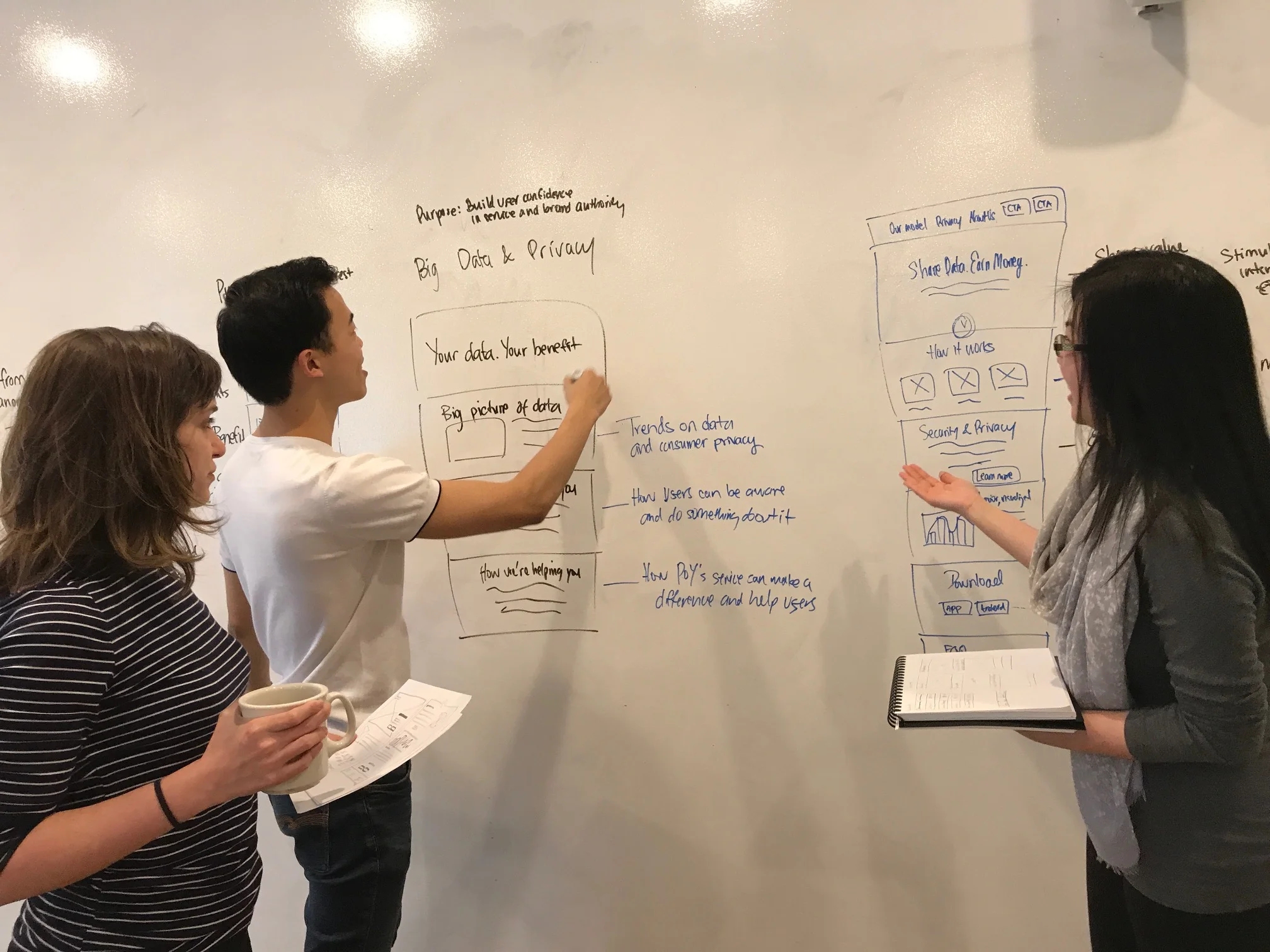
Experimenting ideas
Our team iterated on two rounds of wireframes which included usability testing with 4 users.
This provided insights for our team to move forward with the wireframes shown below before advancing to visual design.
Core insights


Visual language
Humanizing the experience
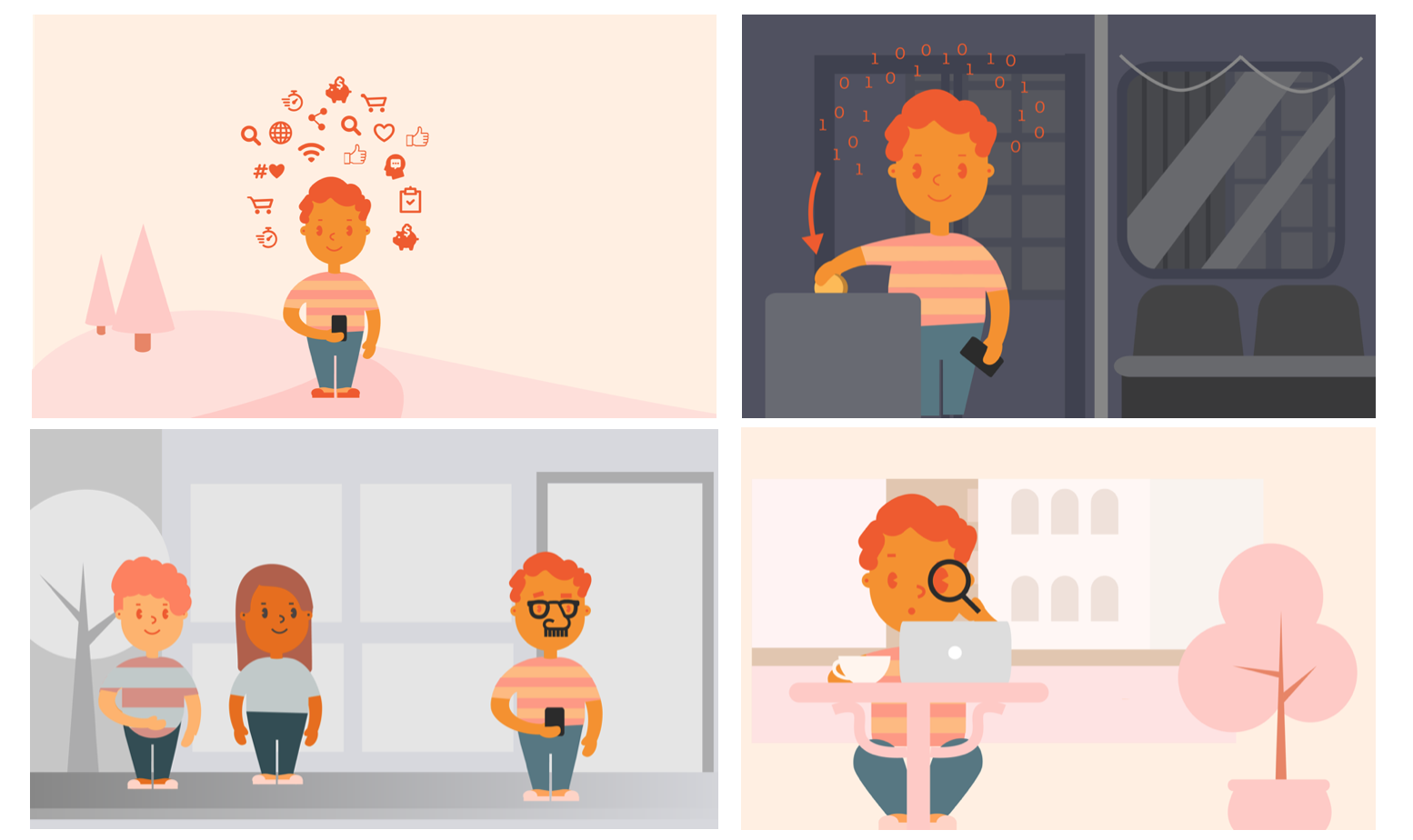
Utilizing a storyboard, it provided a more personal touch to illustrate the value proposition and core features: passive data, rewards, privacy, and insights. It placed "Alex" within real-world scenarios to provide a greater sense of relatability. I worked with an illustrator to bring the storyboard to a higher fidelity.
Color Palette
The brand color palette was refreshed to reduce the harshness of the original orange and conflicting blue/green colors.
We used a color selector tool to help generate more complimentary warm orange tones that communicated a lighter and more relaxed personality.


Brand personality and copy
Our research found that users were confused with the platform because of unclear language and an overly informal tone of voice.
To address this, a simple guide for the brand's voice identity was created to guide the emotional language. By creating a narrative for the brand on the web homepage, we helped guide users through a journey, rather than providing an overwhelming amount of information.
As the product requires users to trust the brand to track their browsing data continuously, a sense of mistrust was present. Our strategy focused on more clearly explaining the benefits of the product in alignment with their needs.
The copy language focused on being conversational, trustworthy, and intelligent.
Solution

Feature focus: FAQ Section — a low effort, high impact solution

Users had frequently asked the same relative questions throughout our research and testing phase. To address this, we designed a FAQ section that would sit at the bottom of the website landing page. This was a high impact, low effort solution that yielded a positive respond from our users. It taught me that sometimes, the simplest fixes to problems can arise from solutions that are straight-forward and to the point.
User feedback
Our solution focused on creating a clear and compelling landing page for the mobile app.
Through usability testing, we learned that this landing page provides a much more easy to navigate homepage that communicates its core features and benefits in a more concise and engaging way. In addition to the visual design, users commented how they liked the added touch of illustrations to help bring more fun and delight towards the user experience.
"It's so much easier to understand what they do now."
"Really appreciate the visuals!"
"The FAQ section is really helpful, as I had a lot of questions surrounding my data."
"Love how there is a story narrative!"
Outcomes
Client approved design solution—product design was shipped ✅
The product strategy and design solutions were accepted by the client and have been shipped
We helped focus product features from 20 to 4 core features, and optimized the positioning of the product
Introduced a more user-friendly experience
Created a brand personality to better represent the product
Helped inform the future of the product direction
What I would have done differently
Given the limited time frame, I would have focused our research efforts on the mobile app + web homepage. But due to the constraints of our project timeline and limited resources, we were only able to produce the homepage concept alongside product strategy recommendations. In addition, further usability tests on our final solution would provide further validation on whether our solution would drive key metrics.
Client Testimonial
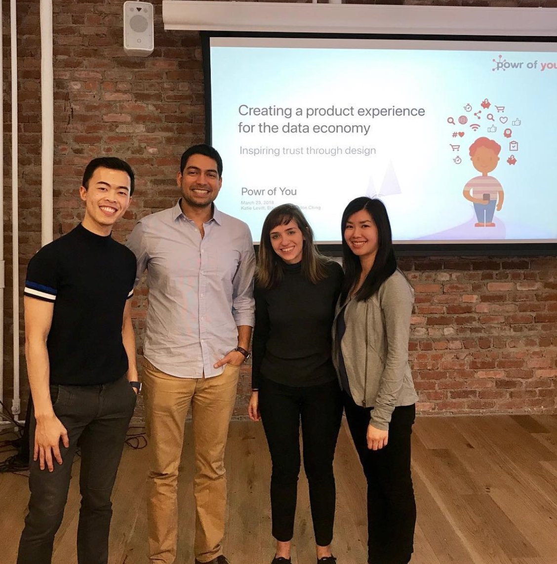
Left to right: Gordon Ching, Keshav Malani, Katie Levitt, Elaine Lok
Gordon worked with us through General Assembly on a UX design project. Right from the start of our interactions, Gordon took charge of the conversation and provided a frame to kick-off the project: with team's understanding, assumptions, goals, etc..
He led his team effectively and carried the energy from start to finish. He communicated throughout the project with updates on milestones, team's questions, discoveries, hurdles which definitely helped minimize the stress of having to check-in constantly.
One of the areas Gordon specifically looked at was the above the fold view when users first land on our site. Though it seemed an easy task at first, he quickly realized the complexity of message (data, privacy, trust, transparency) and content that needed to be presented to the user. Gordon diligently worked through numerous iterations, with many testers, to identify the right message.